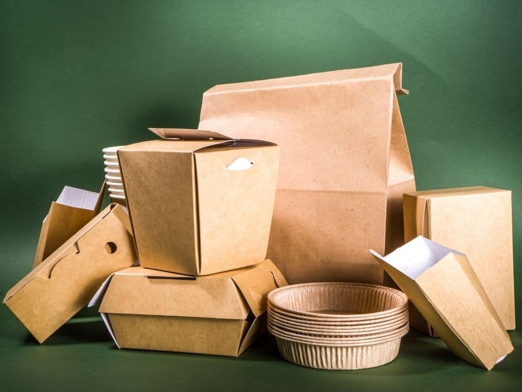
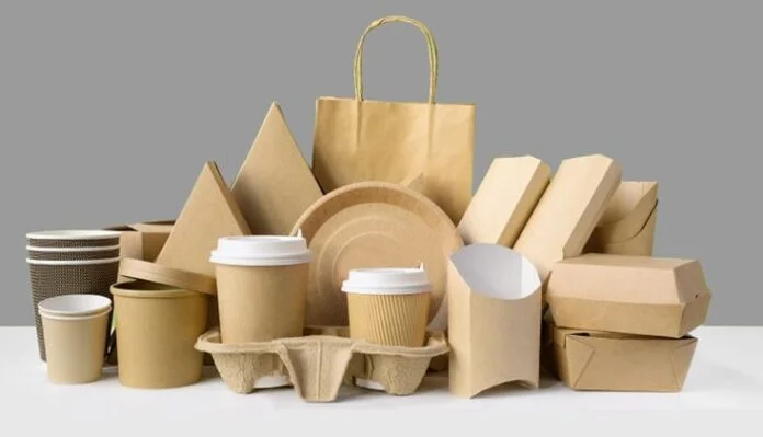
Designing packaging is critical especially to stand out your product in the market. The difficult aspect of the Food and Beverage Packaging design is to make it attractive as well as functional. The target is not attracting potential buyers but also making it useful. Taking care of each aspect of the design is hard but it is always worth it. Because the competition in the market is cutthroat. In this regard, working on your packaging is the most effective way to boost sales.
Designers often struggle with designing that should work to satisfy the customers. The functionality of the food packaging boxes is the main aspect that should never be compromised. Here are the best ten designs for your beverage and food packaging.
1. Retro and Vintage
Vintage are designs that are approximately twenty years old. The 90’s packaging designs were simple yet aesthetic that have their own class. Most often different designs repeat after some time period to evoke emotions in the customers about the past. Retro is comparatively older than the vintage designs.
The idea to use retro and vintage design styles in your food packages makes your product stand out on the shelves. Consumers surely love this idea when packaging refreshes their childhood memories.
2. Illustration Structure
An illustration is the design of specific characters and text in attractive printing visual forms. Most brands use illustration structures on their Food and Beverage Packaging to engage their customers. It gives an aesthetic look to the packages.
However, one thing that these brands ensure is that this illustration should be according to the overall structure of the packaging. The material of each packing is different as well as the shapes. Some materials are glass in bottle form and others are aluminum in can form. Ensuring the compatibility of the design with shape is a must.
3. Creative Joyful Fashion
Not all customers love your designs. Some will appreciate it, while some will find your designs boring. Especially those consumers who love to see unique fashion styles everywhere. This is also one of the great ideas to enhance your beverage and food packing look.
Using different unique styles in a different manner with some product pictures design gives a joyful look. For example, if your product is fresh fruits, then the theme should match it. The picture of the fruits on different packets that are actually inside it with unique designs gives your consumers a unique experience. On a similar note, the printing of natural scenes that represent the product location is also beneficial.
4. Playful and Cute
There are brands that are famous not only for their product quality and freshness but also for their packaging. The use of some cute characters with meaningful messages on each packet differently gives a playful and cute experience to its users.
5. Interactive Humorous

Popular creative thinking that engages the people also becomes a part of Food and Beverage Packaging. There are multiple brands that use humor and joy as the main core concept of their packaging boxes. For example, integrating the pictures of characters like policemen and thieves, pets and housewives, and more like that. The unique opening style with this kind of image reflects your company’s sense of humor.
6. Super Visuals
There are old brands that use this technique of super visuals to stand out in the market. This is the reason that they are still recognizable to their customers after a long time. They use some unique 3D kinds of styles and designs that make their product visuals attractive.
7. Minimalistic Designs
Simplicity has its own attraction. Where the market is full of extravagant designs, the minimalist product quickly gains the attention of its customers. The minimalist designs also reduce the manufacturing cost. However, the benefit of the minimalist design is that it comprehensively represents the product. The product should be visible that satisfies the consumer needs.
8. Mascot Characters
There are three kinds of mascot characters: human, object, and animal. It is a fun and unique way of marketing while making your brand personality. World-famous food and beverage brands have been using these characters on their packaging. This is the reason that these brands are differentiable from others as they are easily recognizable by their customers.
9. Personalization
Personalization is the design technique that companies adopt to give their target customers a unique experience. The customization of food packaging boxes trend will never be out of fashion. The top beverage companies started using the names of the people on bottles. This experiment proved helpful as customers love to purchase the product of their names.
10. Color Blocking and Grading
Colors have an undeniable psychological impact on us. Choosing the right color that fits your packaging style and product is important. Some brands prefer to use one bold color that not only makes their product look attractive but also markets it effectively. However, the technique of color blocking and grading is equally effective.
Color blocking is the use of opposite colors perfectly that enhance the packaging’s appearance. While color grading is the gradual mixing of the different colors that make the food boxes aesthetic
Concluding Remarks
In a nutshell, there are numerous Food and Beverage Packaging ideas in the market as well as on the internet. Select the design that is right and according to your product needs. The design has critical importance in the marketing of your product. Choosing the right design is beneficial as it attracts customers, boosts sales, and earns profits.
Advanced Features of On-Demand Car Wash App Development Click Here

